Color has always been one of the most powerful tools in a designer's arsenal, but in 2026, its role is becoming even more important.
Before someone reads a headline, explores a website, or engages with a brand's message, they're already reacting to visual cues. Color helps shape that first impression. It influences perception, creates emotional connections, reinforces brand identity, and often determines whether someone pauses long enough to pay attention.
That's why color trends matter.
Not because every brand should immediately redesign its logo or overhaul its website every January, but because shifts in color usage often reflect broader changes in culture, technology, consumer behavior, and visual preferences.
As we look toward 2026, graphic design is moving in a bold direction. Brands are becoming more expressive, digital experiences are becoming more immersive, and color is playing a larger role in helping organizations differentiate themselves in increasingly crowded spaces.
We're Seeing a Shift from Safe to Intentional
For years, many brands embraced minimalist design systems built around muted palettes, subtle tones, and conservative color choices. While that approach isn't disappearing entirely, many designers are moving toward more expressive palettes that create stronger emotional responses.
That doesn't mean every brand is suddenly using neon pink and electric green.
It means color is being used more deliberately.
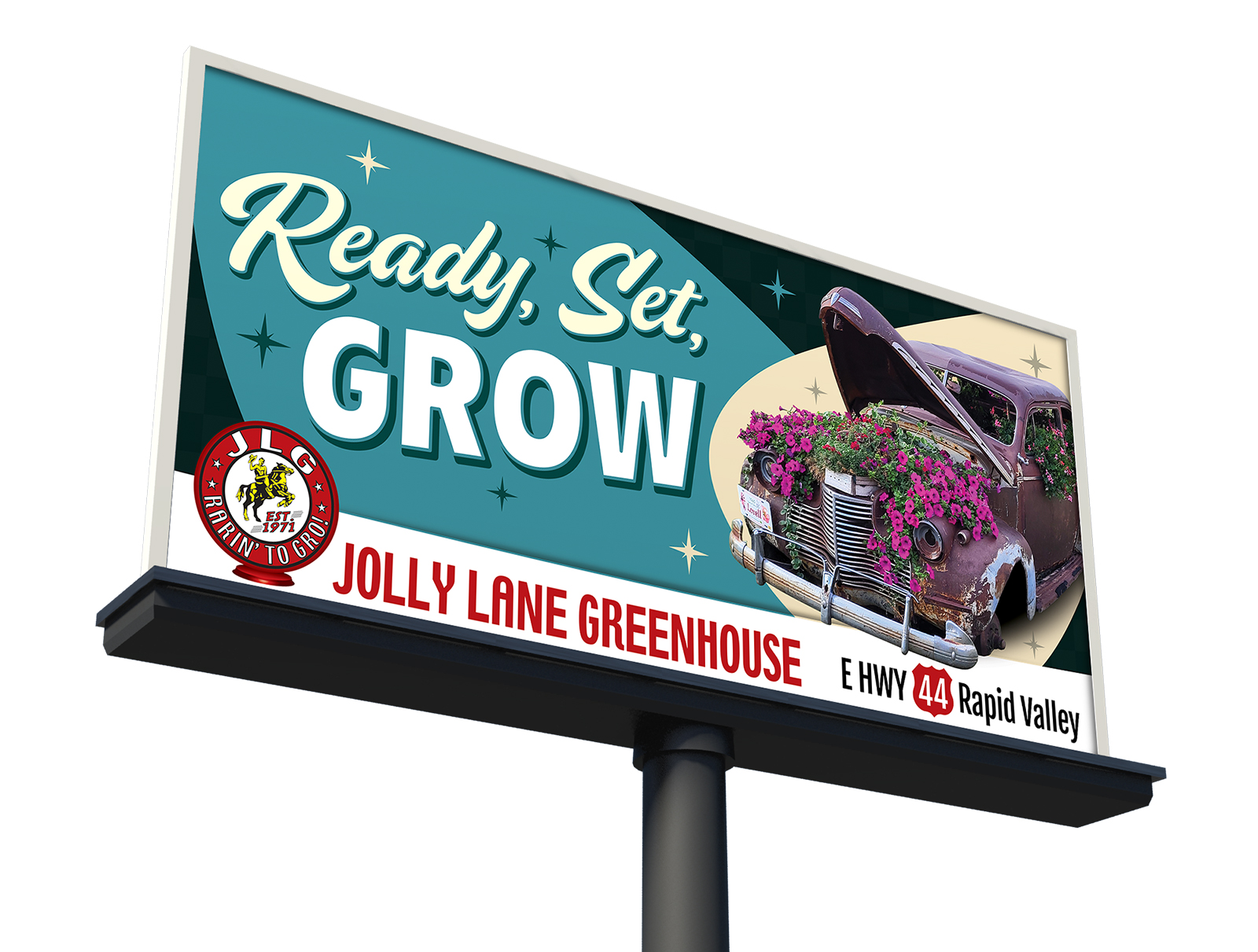
Businesses are becoming more aware that color can communicate personality just as effectively as photography, typography, or copywriting. The strongest brands are choosing colors that reflect how they want customers to feel, not simply what looks attractive on a mood board. - Like yours truly 
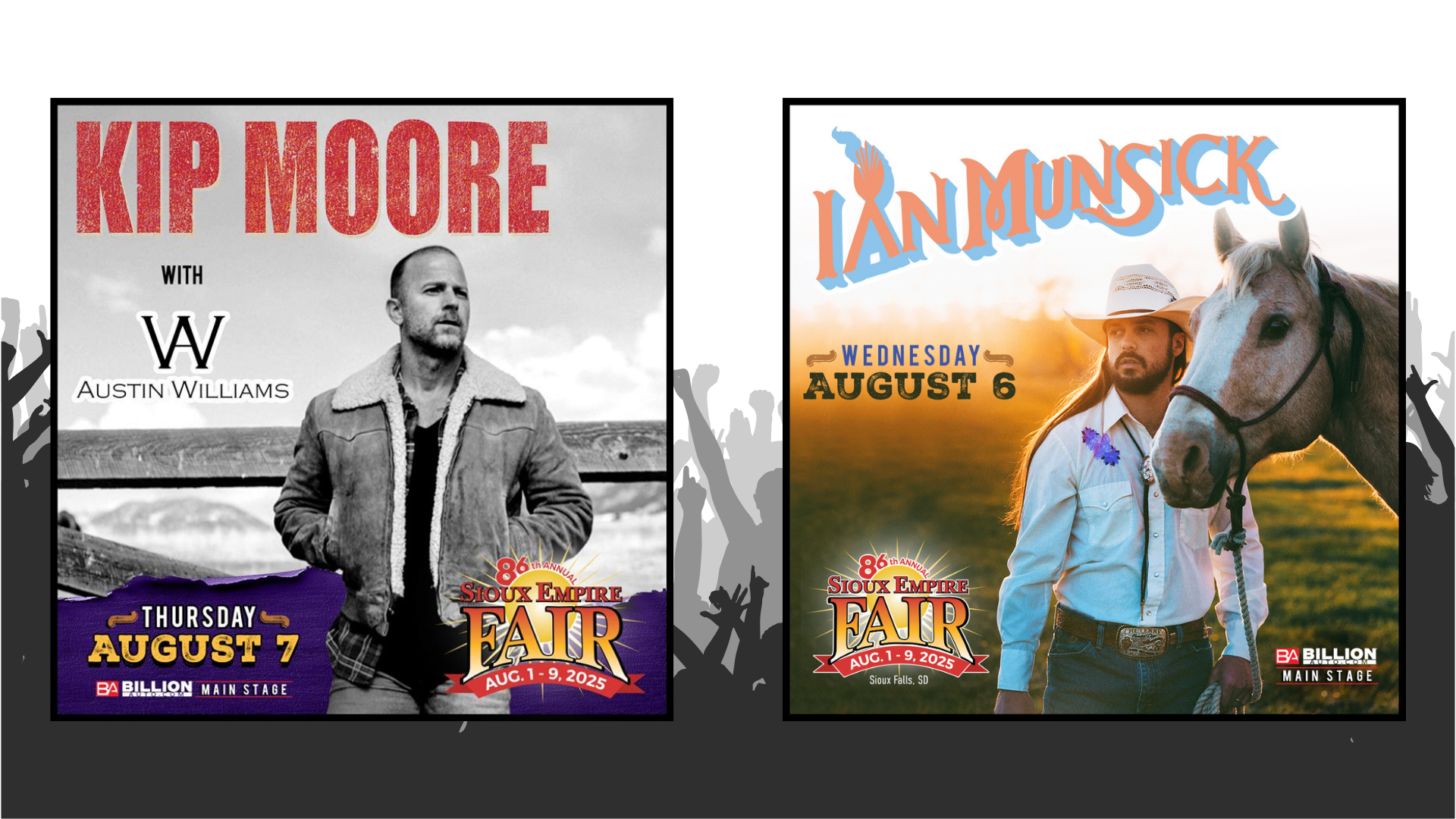
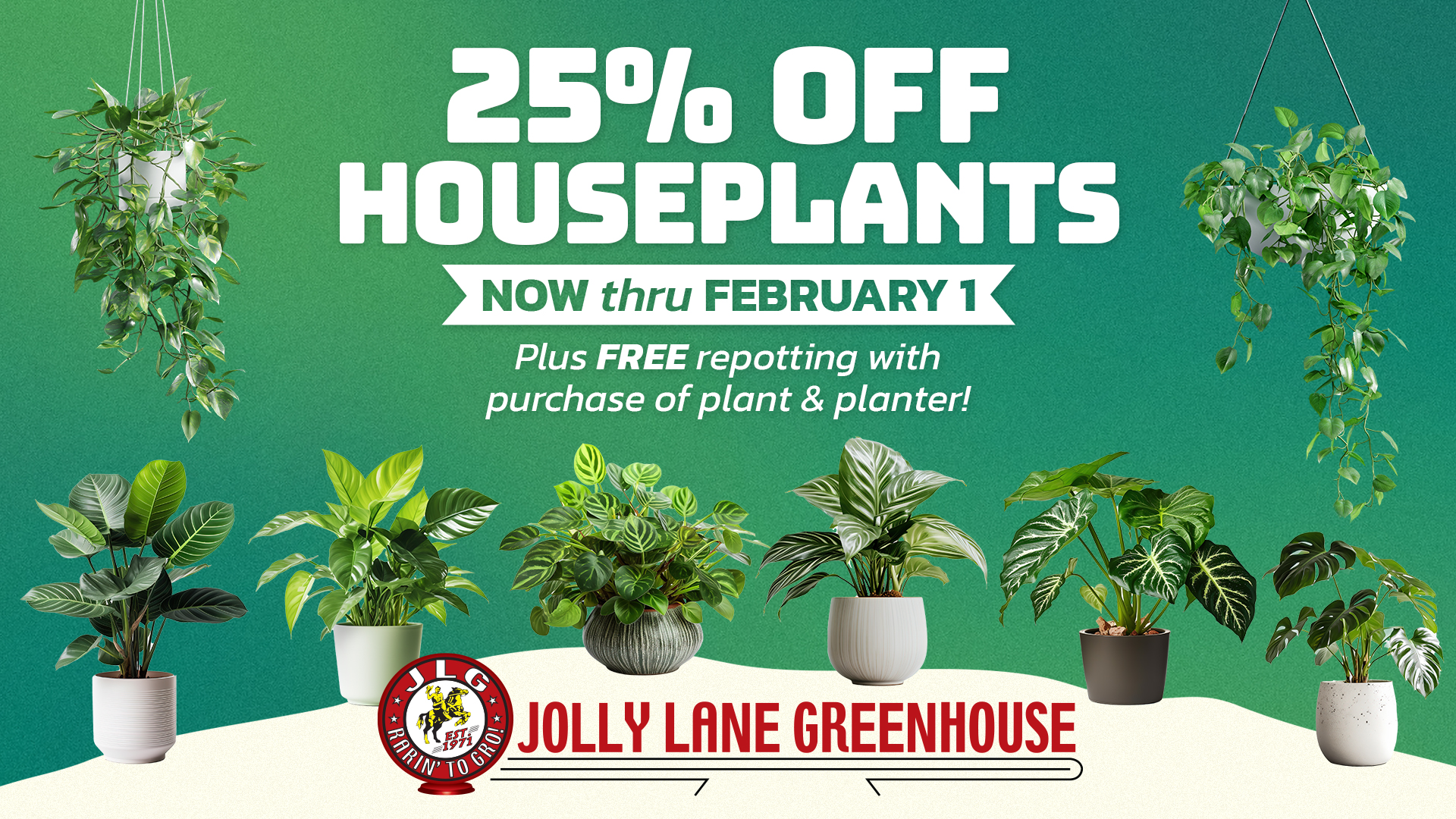
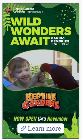
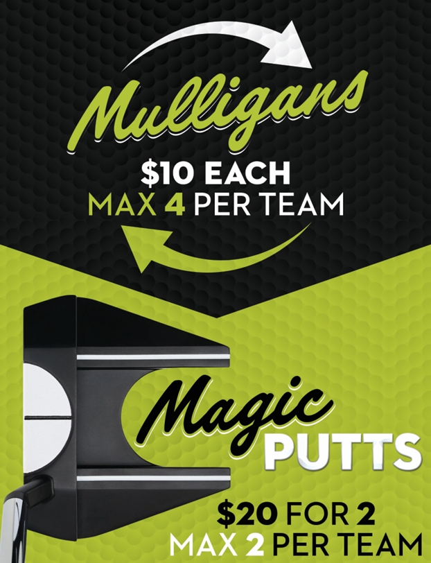
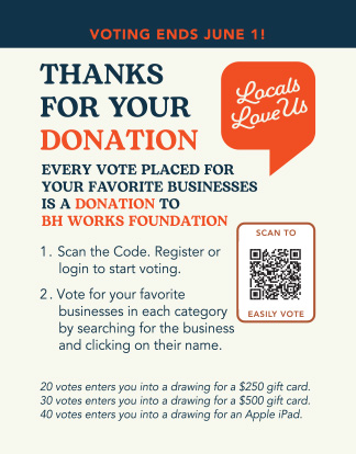
As a result, we're seeing increased interest in vibrant reds that communicate energy and urgency, bold blues that signal innovation and trust, and highly saturated greens that convey growth, optimism, and forward-thinking ideas. These colors aren't necessarily new, but the way they're being applied feels more confident and expressive than it has in recent years.
Emotional Design Is Driving Color Decisions


One of the most significant design trends heading into 2026 is the growing emphasis on emotional branding. Consumers have more choices than ever. Products are increasingly similar. Services are becoming easier to compare. In many industries, emotional connection has become one of the few remaining competitive advantages.
Color plays a major role in building that connection.
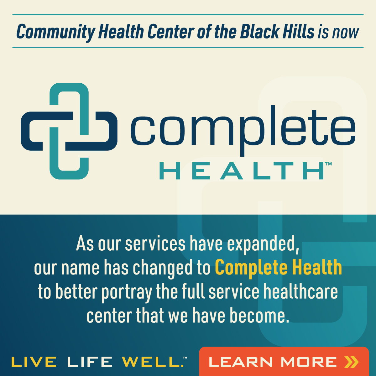
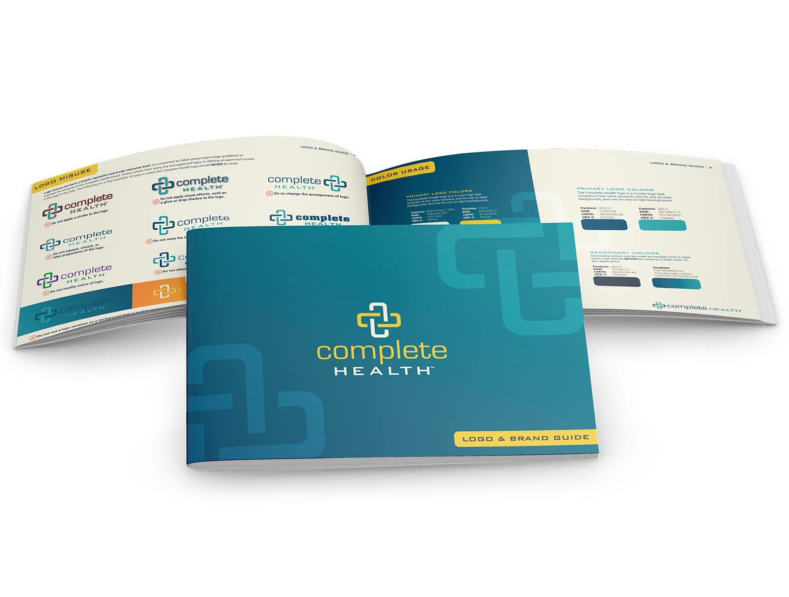
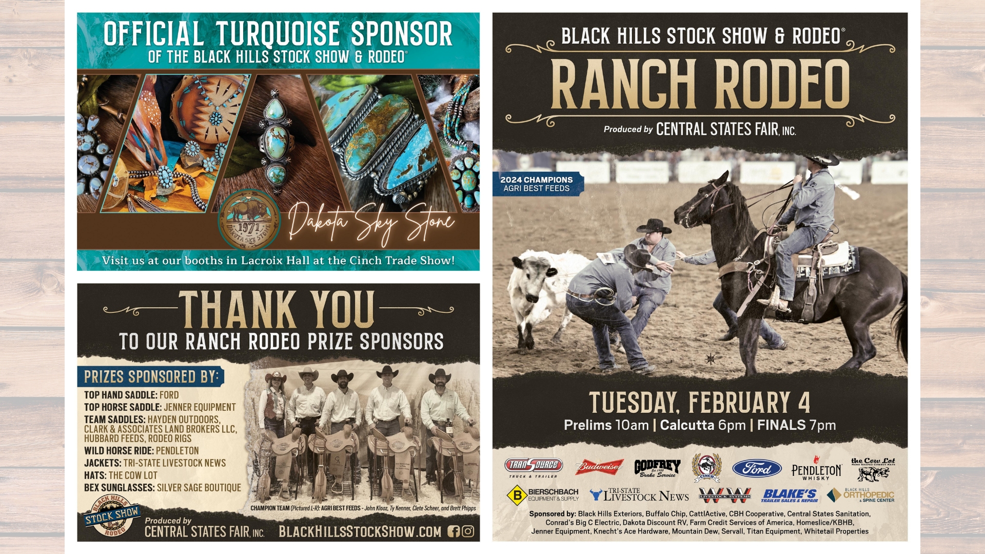
A healthcare organization may rely on calming, trustworthy tones that reduce anxiety and build confidence. A technology company may embrace brighter, more energetic colors to reinforce innovation and momentum. A luxury brand may lean into darker palettes and high-contrast design systems to create exclusivity and sophistication.
The goal isn't to follow a trend. The goal is to understand the emotions your audience associates with your brand and choose colors that reinforce those feelings consistently across every touchpoint. That's where many brands get it wrong. They chase what's popular rather than what aligns with their identity.
High Contrast Is Making a Comeback
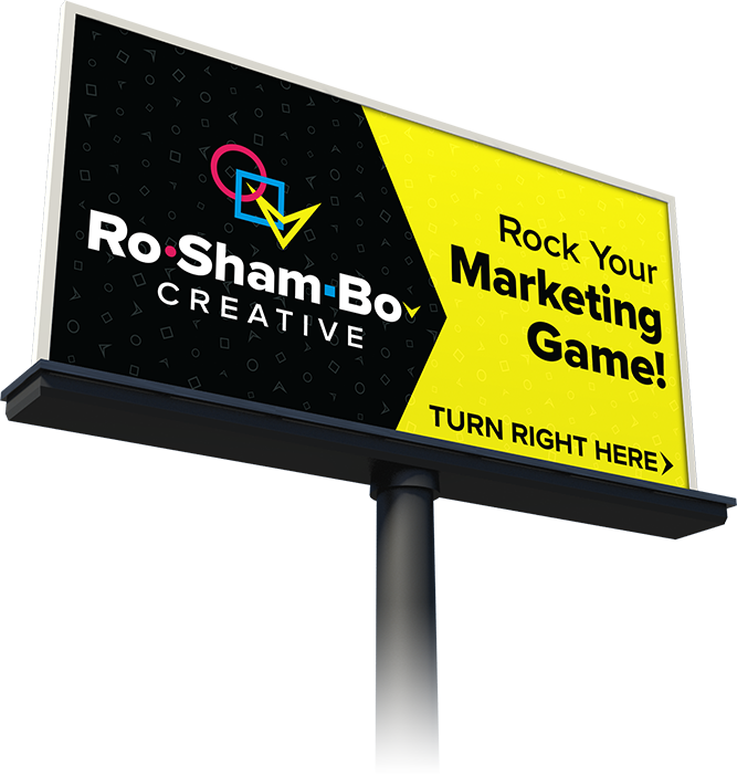
One trend we're continuing to see across digital design is a renewed focus on contrast.
As audiences consume more content across websites, social media, streaming platforms, mobile apps, and digital advertising, readability and visual distinction are becoming increasingly important. Designers are responding by creating palettes that generate stronger separation between elements and draw attention more effectively.
This often shows up through:
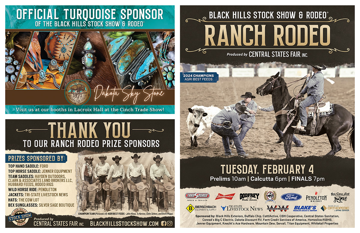
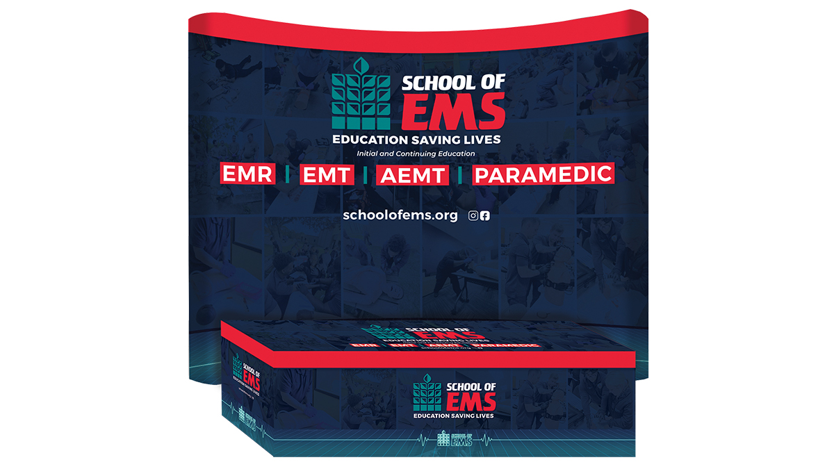
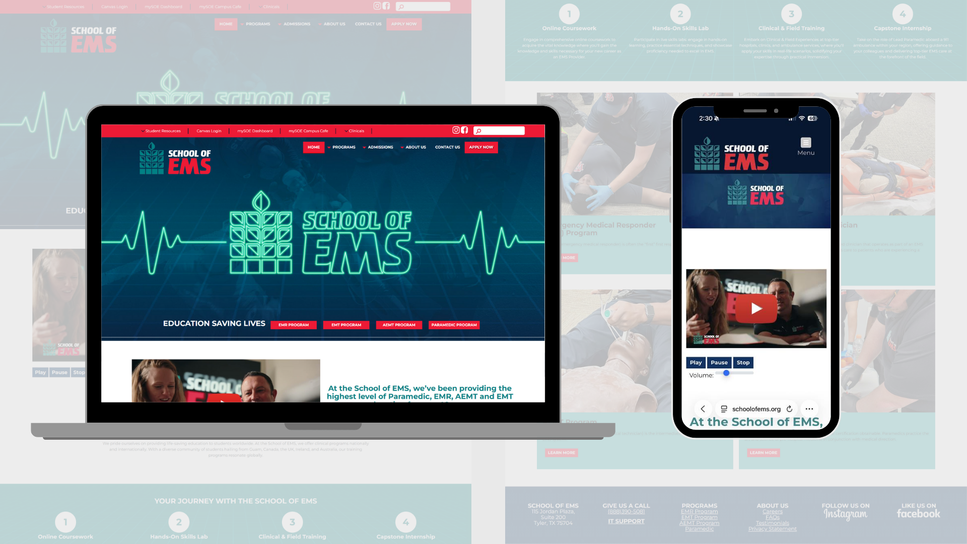
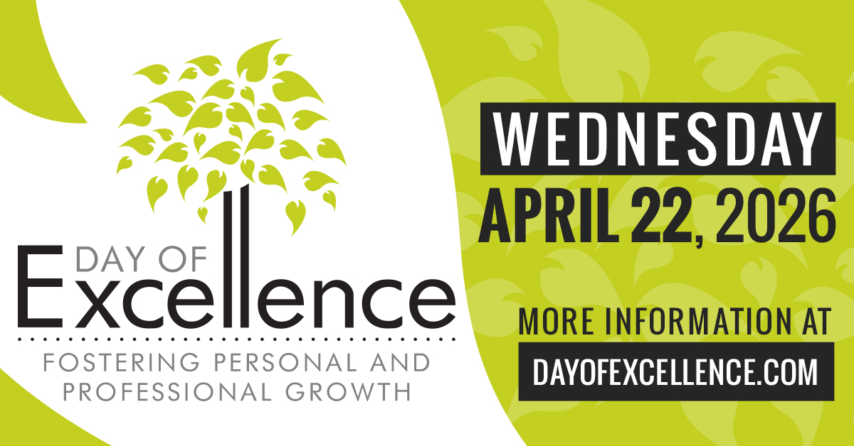
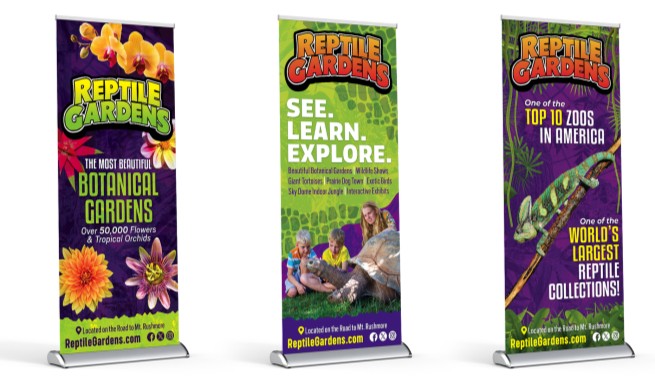
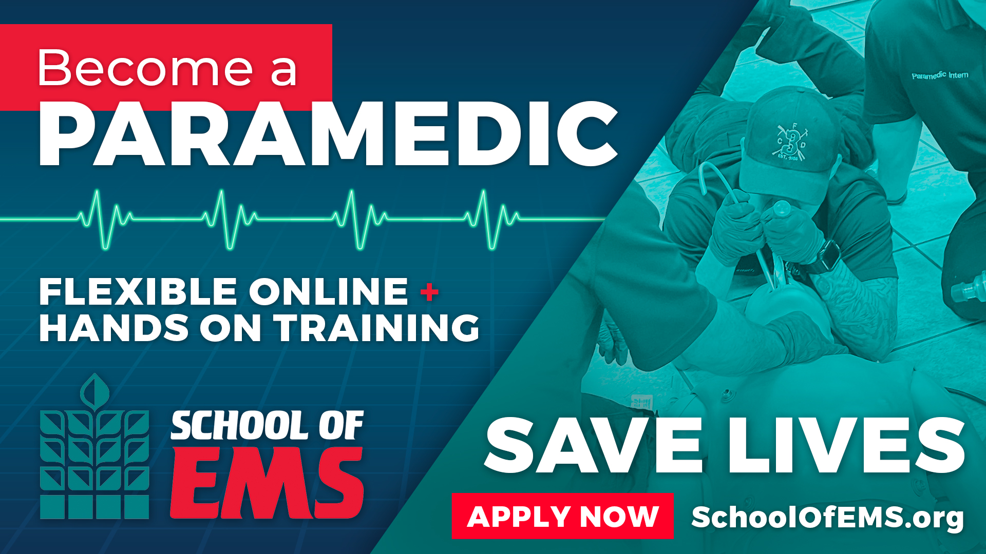
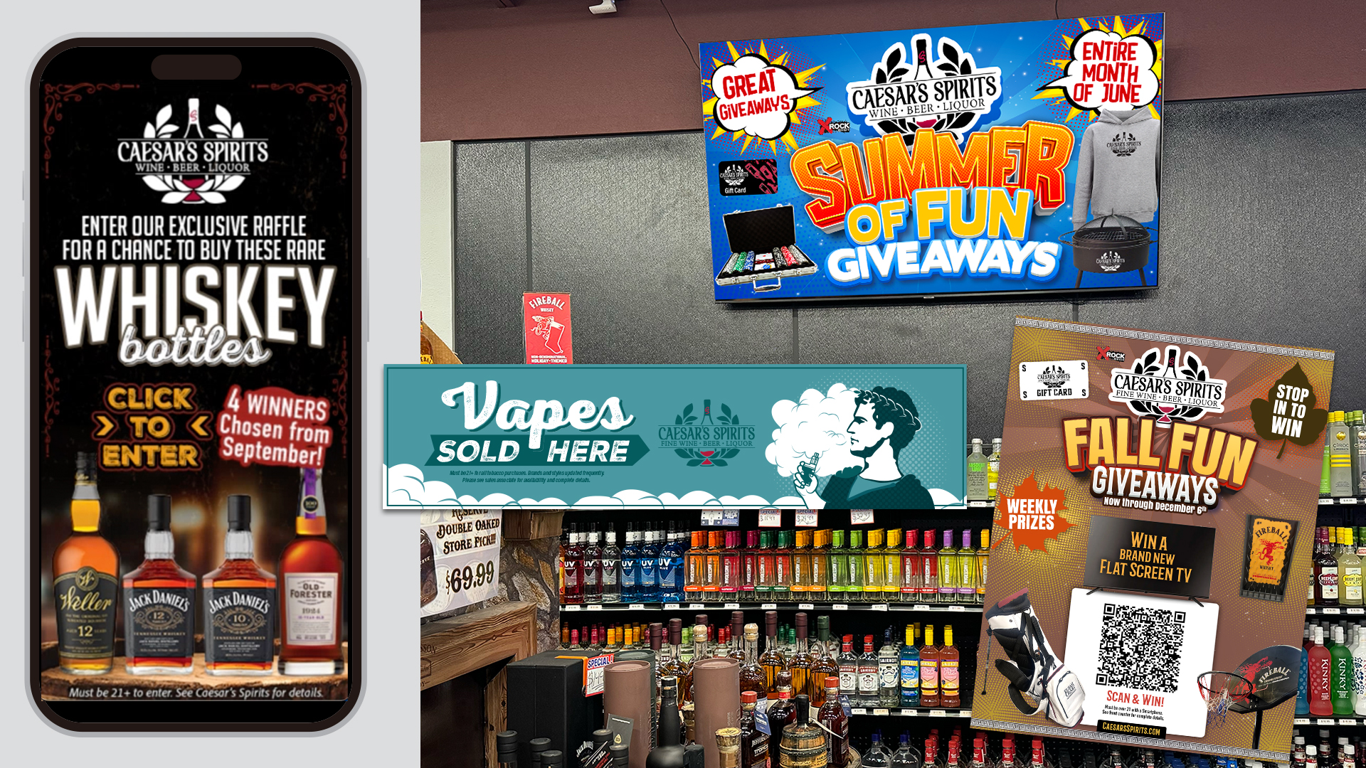
- Dark backgrounds paired with vibrant accent colors
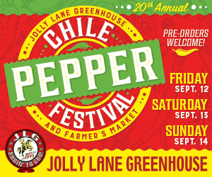
- Bold color pairings that create visual energy
- Strategic use of bright highlight colors
- High-contrast typography and interface elements
- Layered color systems that improve usability
The purpose isn't simply to be louder. It's to help important information stand out and improve the user experience while creating a stronger visual identity.
When used effectively, contrast guides attention and makes design more memorable.
Dark Design Isn't Going Anywhere

While bright and expressive colors are getting attention, darker palettes continue to have a strong presence across branding, advertising, and digital design. What we're seeing now is a more sophisticated version of minimalism than what dominated the last decade.
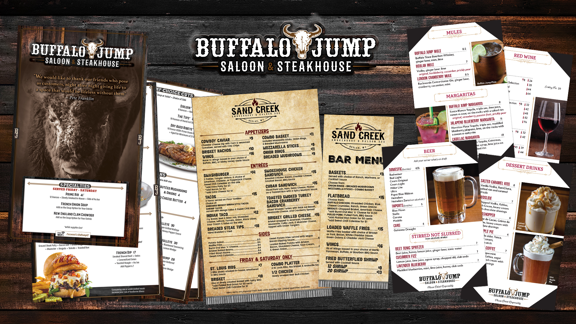
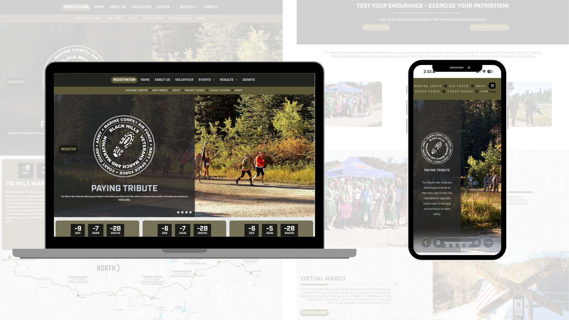
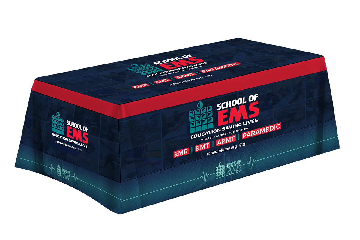
Instead of plain white space and muted grays, designers are experimenting with rich blacks, charcoal tones, deep blues, metallic accents, and layered textures. These combinations create depth and visual interest while maintaining the clean aesthetic many modern brands desire.
For premium and luxury-focused organizations, darker palettes can help communicate confidence, exclusivity, and sophistication. For technology, automotive, entertainment, and lifestyle brands, they often create a stronger foundation for dynamic visual storytelling.
The key is balance. Dark design works best when paired with strategic color accents that create focal points and keep the experience from feeling flat.
Color Trends Should Never Override Brand Strategy
One of the biggest mistakes businesses make is assuming they need to follow every emerging design trend. The reality is that great branding isn't built around what's popular today. It's built around consistency.
A successful color palette should align with your company's personality, audience, industry, and long-term goals. Trends can provide inspiration, but they shouldn't dictate decision-making.
At Ro•Sham•Bo Creative, we encourage clients to think about color as part of a larger brand ecosystem. A color palette should support your messaging, strengthen recognition, improve user experience, and help create emotional connections with the people you're trying to reach.
If we're developing a brand identity for a business in Rapid City, refreshing a website for a company in the Black Hills, or helping an organization expand its reach across the United States, our goal is always the same: create visual systems that are strategic, memorable, and built to last.
While color trends come and go, strong brands endure.
The Future of Color Is Confidence
If there's one theme defining graphic design in 2026, it's confidence.
Brands are becoming less interested in blending in and more interested in creating distinctive visual identities. They're using color not as decoration, but as a strategic tool that communicates personality, sparks emotion, and helps audiences remember who they are.
The most effective brands won't necessarily be the brightest or the loudest. They'll be the ones that use color intentionally, consistently, and in a way that supports the story they're trying to tell. Because in a world overflowing with content, attention isn't won by looking like everyone else.
It's won by being impossible to mistake for anyone else.
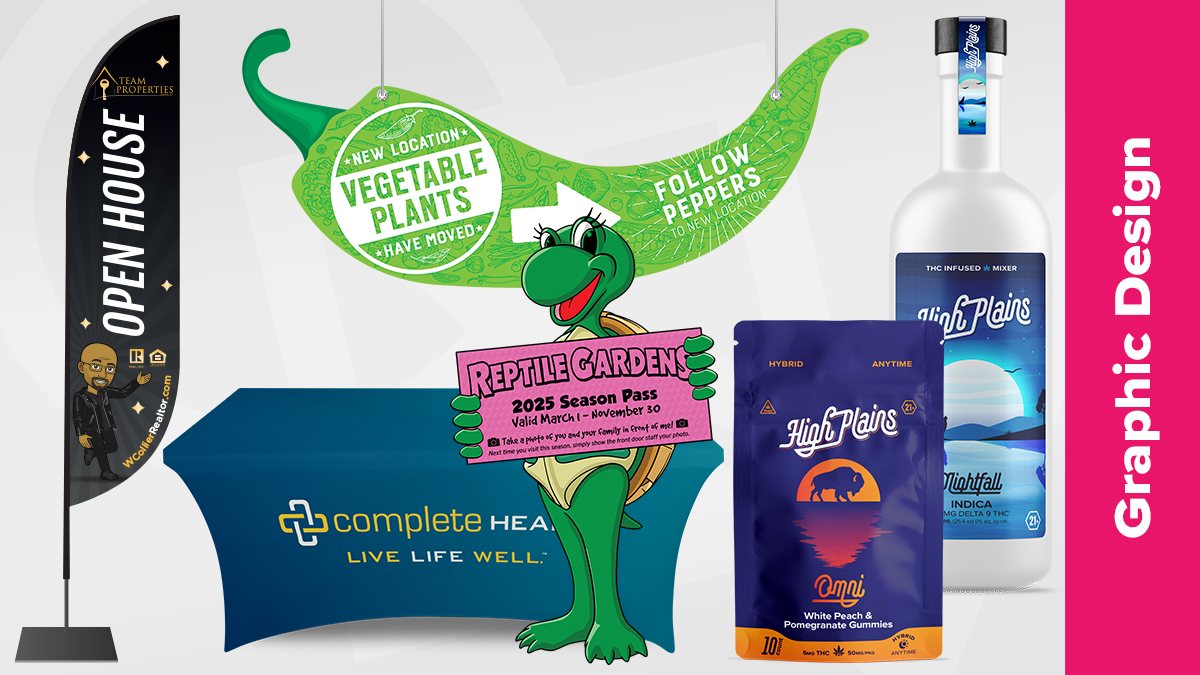
Explore Our Design Team's Extensive Portfolio: